Explore Our Network of Sites
Search
By:
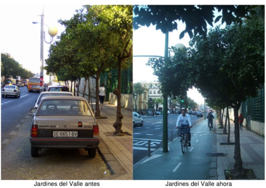
Bike wonks know Sevilla, Spain, as home to one of the fastest bike-infrastructure investments in world history. But installation speed isn’t the only lesson U.S. cities can draw from this wildly successful low-stress biking network.
As participants in a study tour to Sevilla heard last week, Sevilla also shows the power of two values that have been underrated in U.S. bicycle planning: homogeneity and recognizability.

Or, to summarize both in one word: the protected bike lane network Sevilla built from 2007 to 2010 is legible.
“Part of what makes Sevilla work is that the whole thing is just painted green,” said Kyle Wagenschutz, PeopleForBikes’ vice president of local innovation and a leader of last week’s study tour. “You don’t have to be an expert in cycling infrastructure to know how to navigate it. You simply follow the green cycle track and it if it turns, you turn with it.”
Legibility is a value that many U.S. street designers, eager to think creatively about the best option for each particular street, can forget.
But for the potential biking recruit — someone getting around by car, bus or foot whose life might be improved by biking, if only they decided to try it — legibility is essential.
And Sevilla applied that value to a huge share of its major streets.
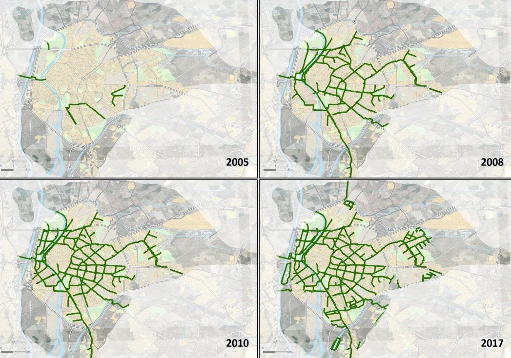
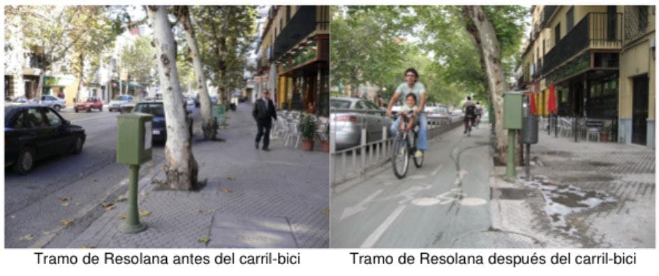
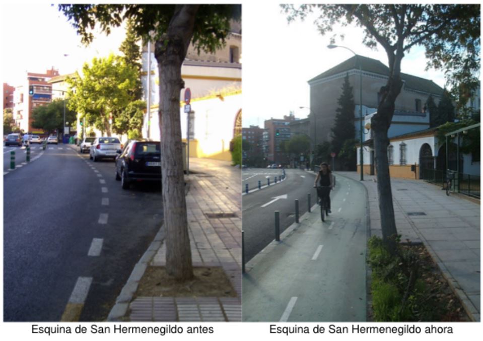
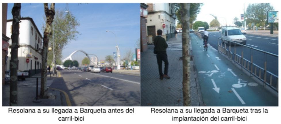
Wagenschutz and delegates from Los Angeles, Portland and Denver met last week with Manuel Calvo, the mastermind of Sevilla’s plan. His slide deck included a series of before/after photos that show the Seville approach pretty well.
Some things to notice in the images below:
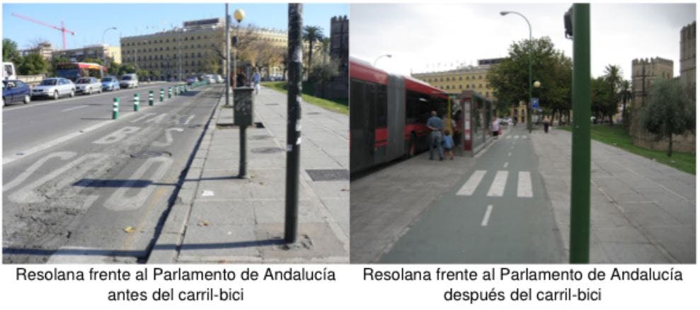
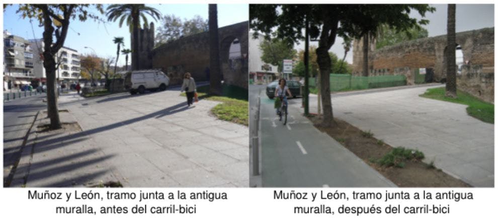
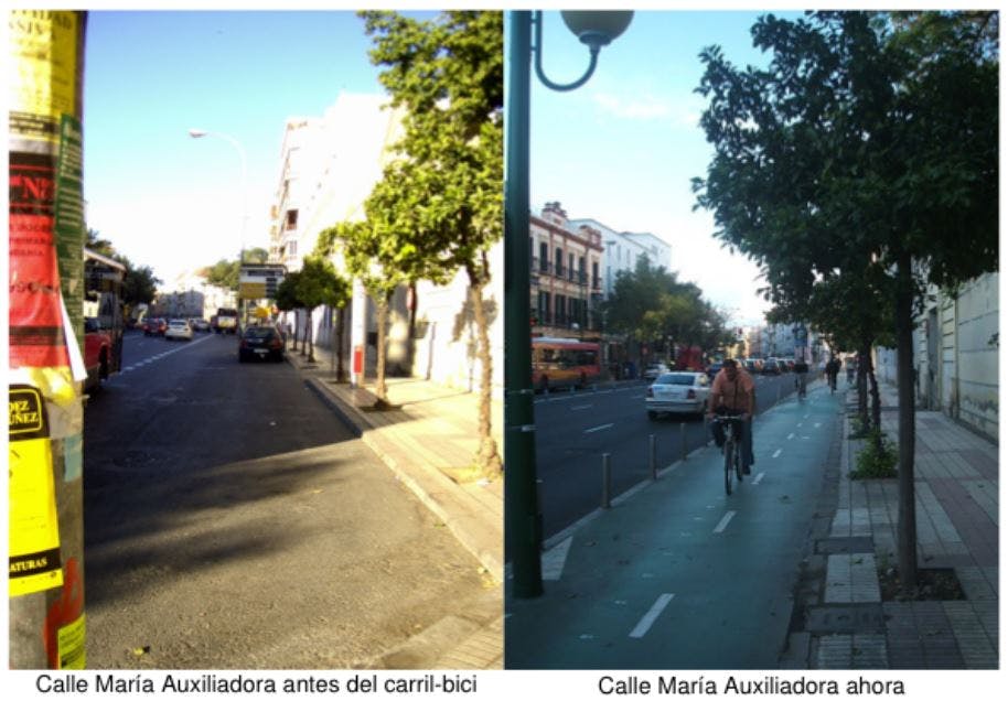
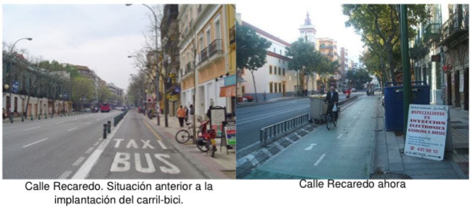
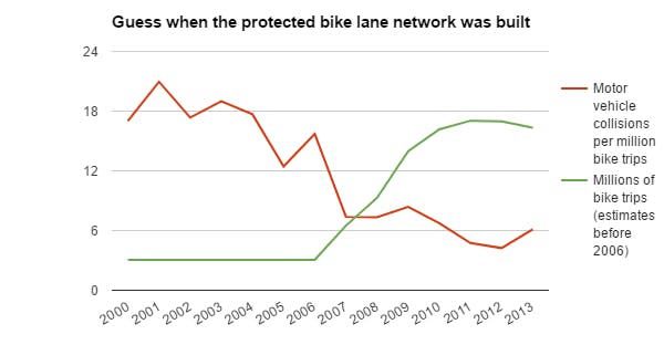
As we reported last year, the result of the network above was that the risk of riding a bike in Sevilla immediately plummeted, and the number of people biking soared:
Wagenschutz said Monday that homogeneity and recognizability are things more U.S. cities should keep in mind as they design biking networks — even if they never achieve the consistency that Sevilla, building its network very quickly, was able to.
“What if there were some very visual way for you to understand whether you were on the bike network at any given moment?” he wondered. “Or whether you had wandered from it?”
It’s an idea people will get to hear about directly from Calvo if they attend the PlacesForBikes conference in Indianapolis next month. He’ll be a keynote speaker.